Here’s why a lotus flower is the worst logo you could choose for your yoga business.
Hi, my name is Jade and every time I see a yoga or wellness business using a lotus flower logo a little bit of me absolutely dies inside.
In my opinion as a business consultant (with nearly 20 years experience working with global brands and their identities)a lotus flower is the worst logo you could choose. Followed by a yoga figure. Or a combination of the two. And I’m going to tell you why in a moment…
Frankly, you deserve SO much better for your business! You deserve a stand out presence that feels just like you, captures the essence of exactly what you do so people gravitate towards you (over the other people near you who do the same).
The best kept secret is the fact that actively choosing to go the other way helps you make the kind of money and help people on the level you can barely even comprehend right now whilst you’re reading this blog. My previous branding clients? Selling out retreats and making thousands. Teaching at Om Yoga Show. Waitlisted classes every single week with packed corporate books. Heck, I was the go-to teacher in my town constantly with people telling me they chose me because of my brand and professional appearance. This stuff WORKS.
You’ll know if you’ve read my other blogs, or followed me on Instagram that I categorically never design logos with lotus flowers, yoga asana (poses) or any cliche wellness industry visuals in them.
My preference is always for totally unique visuals that no one else is using.
Let’s take a deep dive into branding and why this logo choice is totally at odds with the purpose of branding -and the proof of why you are worthy of something as special as you are.
What is branding?
A big misconception is that Branding = a logo. It’s actually far more compelling than a logo in absolute isolation and includes a number of areas including audience research, definition, strategy based on that audience’s needs then the fun visual stuff like logos, colours, fonts and imagery.
Branding is defined as:
“A brand is a name, term, design, symbol, or any other feature that identifies one seller’s good or service as distinct from those of other sellers” (American Marketing Association).
You can distill this into the way you set yourself apart in your customer/target audience’s eyes from other providers offering the same services as you.
In other words - so you don’t look like other yoga teachers or wellbeing professionals. The key word in this sentence is DISTINCT. i.e. unique, looks different and differentiates you from other people in your sector.
If that’s why branding exists, then why the fuck do so many yoga businesses have essentially the exact same logo?
The argument and justification I regularly hear for this is “it’s yoga, that’s what it is” but I will die on the hill that this is the wrong way to be thinking. It minimises what you’re doing and the massive transformation that your work delivers to people.
I always think some of this comes from the inherent issues we have in the wellness industry with acknowledging and valuing our worth as a predominantly female profession (that’s another post for another day…) It can feel terrifying to stick your head up over the ledge and say “hey I’m taking up space and I’m ready to shout about the awesome work I’m doing”.
So, you opt to look exactly like everyone else.
It’s just totally against what the actual point is.
You shouldn’t look like everyone else. So don’t use the same visuals as everyone else. See your work and yourself as worthy and set yourself up to make even more people’s lives better.
I also think that a lot of people are totally new to business (and often aren’t taught any of this stuff on their Teacher Training) so you don’t even realise there is a better option for you out there!
The issue with looking the same as everyone from a wellness perspective

We’ve all seen some variation of this logo many many times. Sometimes it’s a flower on its own, sometimes it’s a figure on its own…. it’s all singing the exact same song.
When the reality is every yoga teacher is totally different.
I’d say in the region of 50-60% of the accounts who follow me on Instagram (around 500 or so) have a variation of this exact logo as their branding.
The problem comes when we think about HOW people perceive yoga.
Yoga and the wellness industry has a big image problem - people think its for thin, white, bendy people not for everyone and often these businesses use visuals like the one on the left here.
We don’t help that perception when all we do is select the same tired visuals time and time again, that reinforce stereotypes and don’t do anything to visually set our own unique lenses apart.
Logos and visuals like this make it really hard for students and clients to see how you differ from that perception they have in their mind, or from their previous potentially bad experiences.
Ultimately, if a potential customer is struggling to understand where you fit, what type of vibe they’re going to get in your sessions because you’re not helping them do that they are just going to switch off and try and find someone who they can quickly decide they’re a good fit with.
Branding is there to help you tell a subconscious, contextual story and quickly explain what sort of thing people are going to get when they buy from you. That is why it is so powerful. And if you’re using this generic rubbish, you are absolutely missing out on clients and money.
A logo doesn’t need to be literal. It needs to be usable.
The other side of this is the misconception that a logo “has to show what you do”.
It doesn’t. Nike doesn’t make ticks or “just do it” (whatever “it” is)… Apple don’t make Apples with a bite missing out of them…
A logo is there to give an impression, a feel and a vibe - it doesn’t need to be a literal image of what you do. It shouldn’t be either.
Trying to shoehorn loads of different elements into a logo leads to complicated, fussy logos that aren’t practical to use in the real world.
This is the sort of thing that happens when this misconception is allowed to take over. The business owner ends up with visuals that are too detailed to actually be usable, or something wildly irrelevant (more on that in a mo). That means you can’t see what is going on when it is set to the correct size and it isn’t legible, or because it’s been done cheaply without the variations that are necessary to make the brand usable in the real world.
So, you end up with over prominent, over sized graphics everywhere, poor colour contrasts, logos that don’t match the personality or experience, which just doesn’t look professional or well executed. Not what you want when you’re trying to attract people to your sessions.
This is exactly what people used to say about why they chose me as their yoga teacher over the others in the area. Every time. I simply looked slick and professional whilst everyone else looked DIY and disconnected - which allowed me to charge more, because my clients trusted I would deliver a great experience and could see I took what I do seriously enough to invest in myself.
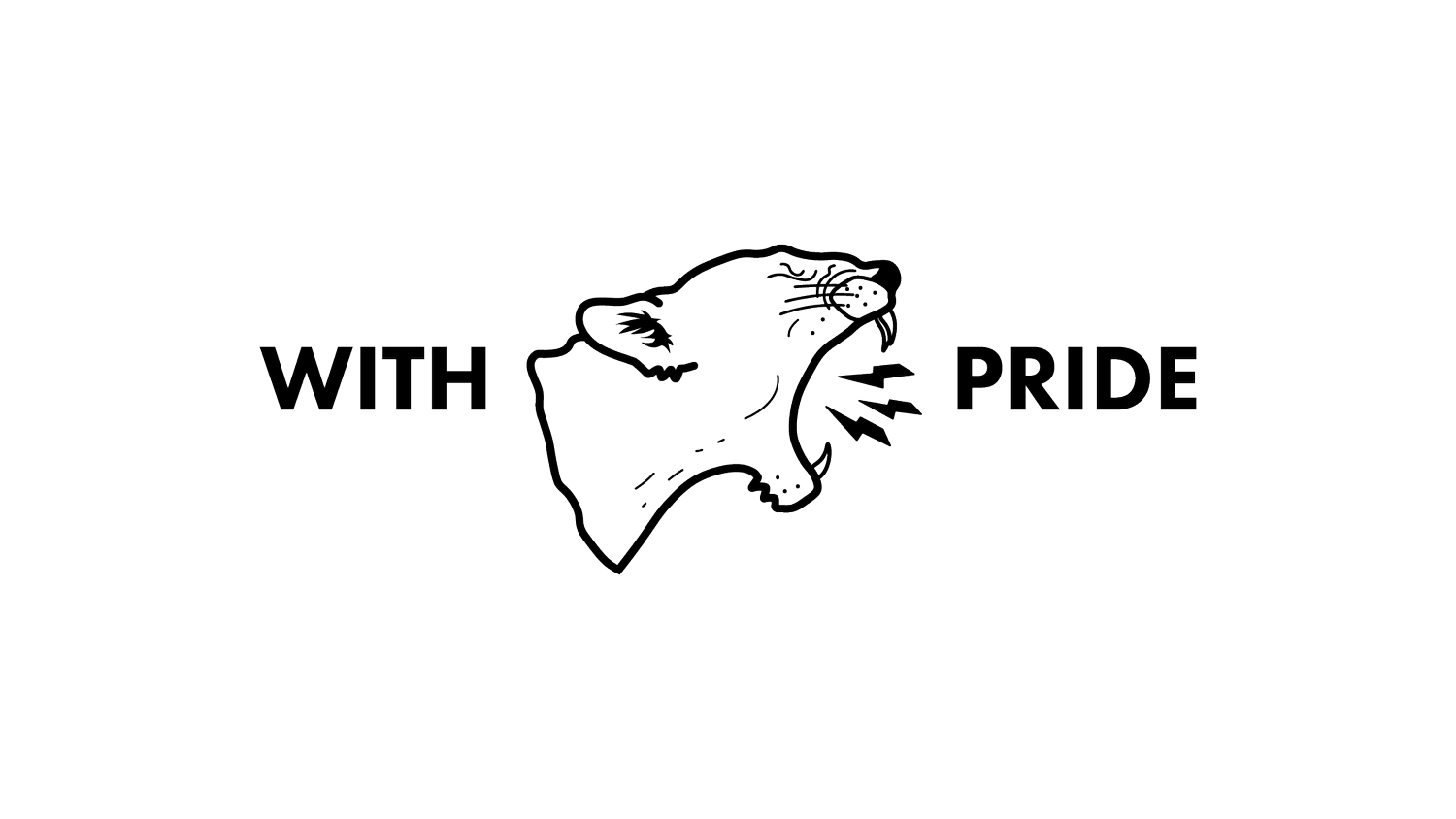
The best logos are simple, and use shapes, colour and references to create that impression. Let’s take my logo as an example:

This is a pretty simple concept.
The main element is a lioness who is roaring lightning bolts.
Am I a lioness that shoots lightning bolts out of my mouth? Obviously not. Although, that would be cool as, let’s be honest!
I work with strong females (you could say lionesses) who need to shout about the work they do (lightning bolts) and step into their power. Again, you could say a lioness is a great representation of that mindset and power.
As a side note, I also love cats and I am a Leo. So lots of layers and meaning in there in a simple package that works at every size.
It can be suggestive and communicate an idea, mood or feel so people capture that additional information easily and physically see that you are different to what they’re expecting - your approach isn’t the misconception they have in their head.
That immediately creates differentiation in a subconscious way, which is exactly what you want to help you stand out in the sea of wellness businesses out there.


Here’s some other examples from my Portfolio. Every single one of these examples are ALL Yoga Teachers. They all have very different audiences and approaches, and all have very simple, impactful designs - without a single cliche visual in sight. Some are more bold and no nonsense, some are very inspired by mindfulness. And you pick that up, at a passing glance. It shares their stories, beautifully - and every single one of them says it’s made them more money, brought more opportunities AND feels like them.
everyone is not a design expert.
Canva, Fiverr & lazy designers doing jobs on the cheap aren’t doing us any favours here, either.
Before I get started laying into Canva here…I love Canva. I use it to create social graphics for With Pride Creative and also templates for my branding clients too. It’s a great tool to use for accessible collateral - the design pieces that are deployed in the real world.
It just is not the tool to use for logo suites. It’s a drag and drop/library based tool meant for social graphics and quick design that is pretty limited with what you can create within the software in comparison to a professional tool like Adobe Illustrator (what I and every other Brand designer worth their salt uses.)
My issue with Canva is it makes design seem simple, when it isn’t. Unwitting business owners just pick up a template, pop their name on it and call it a day and then wonder why they are having issues with usability, customer perception and so many more things.
I also don’t agree that they market it as a tool for logo design, either when you will run into issues straightaway using a logo from their platform. It’s misleading AF and just causes headaches because you don’t know better, until you know better.

An example of the Canva logo issues I’m talking about from a Client Website Audit:
The header & logo on this website is HUGE because if the header is set at the proper size (100-180PX max), the logo is totally unreadable. So, the yoga business owner has made the logo overly dominant so you can read it. That isn’t fit for purpose, and typical of DIY Canva designs. It doesn’t scream professional at all.
These logo templates on Canva are always going to be generic and not unique - they’re mass market designs. Any logo template on Canva is literally being used by thousands upon thousands of businesses out there. They’re often very dated, totally unusable (see my previous point about fussy design & impracticality).
Your customers will 100% have seen some of these logos being used by hairdressers, florists, masseuses, therapists, beauticians and so on. So they absolutely know you’ve used a template which just comes across as cheap and an unwillingness to invest in your business.
How can you be asking them to invest in your service when you won’t invest in yourself? That is what those customers are thinking. Harsh but true. It alters how they see your business and also what they are prepared to pay for your services, so it’s harder for you to charge the prices you want to and get people to commit to you in the way you deserve.
You would never be able to use a Canva logo and trademark it, for example. They own the Intellectual Property of ALL premium elements; so you cannot register it - you have to own the Intellectual Property and Copyright of any logo design that you register.
Plus, your file resolution and size options are incredibly limited to JPEGs & PNGs, not vector files and the conversion from digital colour spaces to a print colour profile is notoriously unreliable.
My other pet peeve is Fiverr/designers cutting corners, and praying on business owners with very limited budgets.
These designers and resources aren’t designing with care or bothering to do the basic groundwork a legit brand designer would always do - they don’t do any industry research or understand the nuances within the industry they are designing for… so they lazily churn out cliche design like these lotus flower logos.
This drives me mental as it is essentially wasted money down the drain for that independent teacher who was trying to do the right thing and has ended up with something totally unusable or that doesn’t position them correctly so they’re losing out on even more money.
I’ve experienced this personally so many times - a client will have hired someone from Fiverr, paid them £250 or so, they’ve got a logo and no colour palettes, positioning, visual guidance, tone guidance or understanding how to deploy anything they’ve been given, end up attracting totally the wrong crowd, get discouraged and downcast and then need to pay again to have their brand suite done properly, again.
It’s worth saying I absolutely understand budget can be the issue with committing to work like this. My view as a brand strategist, designer and business consultant is this:
Branding, coaching or anything you spend like photography costs are literally costs of being in business. These things make you more money, categorically. Marketing your services is the one way you have of bringing revenue into your business, also.
Properly designed branding can add up to 23% on your revenue without changing anything. I’ve personally had clients land magazine covers, sell out international yoga retreats and more after investing in their branding. I’ve doubled and doubled my own revenue again over the past 2 years. So my own experience has been significantly more than that 23%.
The basic principle of business is maximising your returns on your investments. So, you price your services accordingly and budget for that investment.
When I started my first business Pride Yoga, I set aside £1500 to invest in my website, branding, some photography and equipment to get me started - granted I did some of it myself as I had the skills, however, I made my investment back within the first month.
As a side note: this is why I offer a couple of different branding packages with different levels of deliverables so there are options to suit you and you still get a suite that you can use for years to come. It is far better to save for a bit, or have a chat and sort an extended payment plan out and get the job done properly first time, instead of scrimping and getting a half arsed job that needs doing again instead.
branding is there to position you as the go-to person for your audience. that takes strategy. not going straight to design.
Everything has to start with your audience - knowing them deeply, what their problems are, how they want to improve their lives, what their aspirations are, what their drive is. Only then can you know what type of services, logo style, colours, wording, tone to use to match up with those people.
Then your branding should be speaking to those motivations and bringing that to life and understanding how that story can be translated visually and subconsciously when your audience come across you. That helps you tell your story in a more compelling way, and keep clients coming back so you’re not working quite as hard marketing without the pay off.
If you’re not an expert, then that’ll be pretty effing hard to do (plus, doing this for yourself is absolutely nails as you’re so close to it). If this is something you need support with, I offer Brand Workshops as part of my Big Brand Package, or you can book a one-off Pick Your Brains Session here.
Your brand visuals are there to set yourself and your business apart from everyone else in the wellness space.
Your classes and offer is totally different to everyone else’s and flows from your unique experiences and viewpoint of the world of wellness.
That is why using a lotus flower is the worst thing you can do.
If that’s you, it’s time to consider taking a look at your branding. If you would like a review of what you’ve already got a Brand Audit would be a fantastic place to start. If you’re ready to crack on full steam ahead, a branding package would be perfect.
If you’re after more free tips, check out my instagram or get on my Thursday newsletter for some tips to start shifting the needle, straight away.